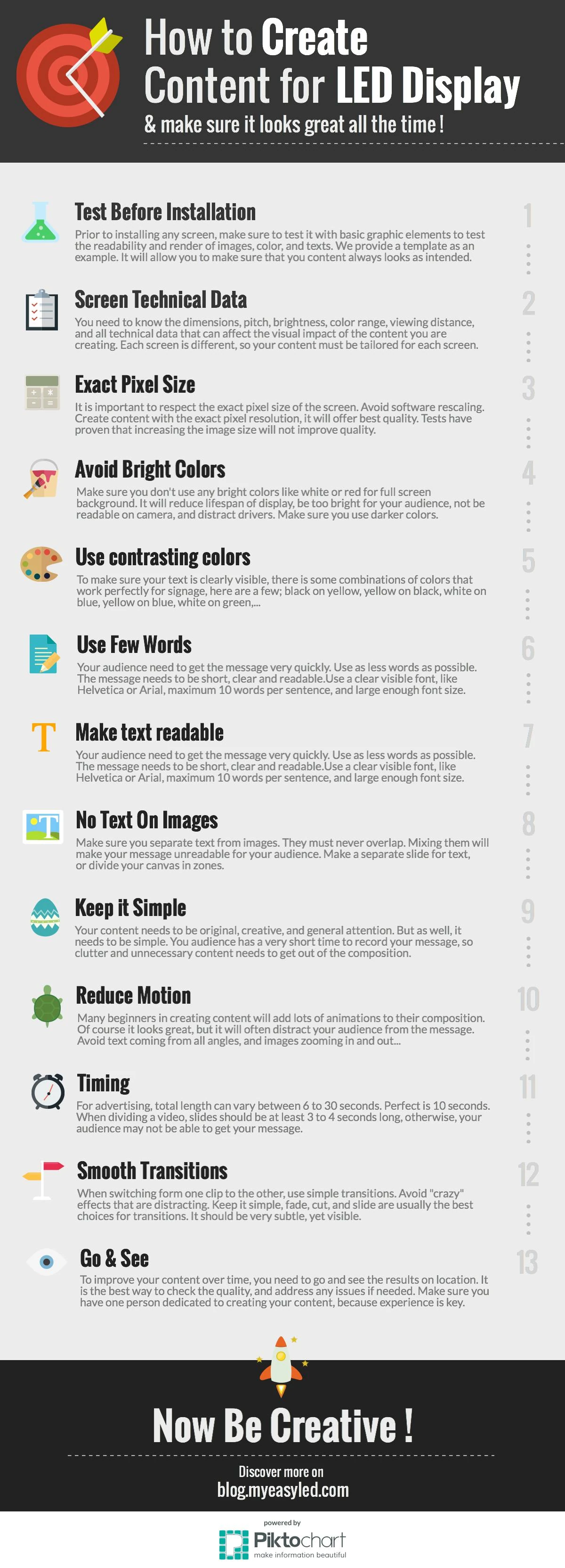
We published this list on the original easyLED blog years ago, as an infographic, because we kept giving the same advice on the same site visits. The technology has moved on completely since then. The list has barely changed at all, which tells you something about where LED projects actually go wrong.
Here it is, exactly as it went out. Below it, the same thirteen rules with the arithmetic that makes each one arguable in front of a client — because “make the text bigger” loses that conversation and a number wins it.
A wall is a canvas with unusual rules: it makes its own light, it has a resolution nobody designs to, it is read at speed, and it costs real money to run. Content that ignores those four facts looks amateur on the most expensive screen in the building — and the client will blame the screen.
Thirteen rules. The first two are the ones that save you.
1. Test before you install
The cheapest moment to discover that the client’s logo turns to mush at 6 mm pitch is before the wall is on the wall. Ask the manufacturer for a demo panel, or get a single cabinet on the bench, and put the actual artwork on it.
If you cannot get a panel, do the poor-man’s version: export the artwork at the wall’s exact pixel dimensions, then view it at 1:1 on a monitor from the distance that corresponds to the real viewing distance. It will not show you brightness or colour, but it will catch every legibility problem, and those are most of them.
2. Get the technical data first
Every screen is different, so the content has to be made for that screen. Before anyone opens a design tool, you need six numbers:
- Resolution in pixels, width and height. Not the physical size — the pixel count.
- Pixel pitch, which sets how far away detail survives.
- Brightness in nits, and whether it is dimmable on a schedule.
- Viewing distance, the nearest and the typical.
- Refresh rate, if anything will ever be filmed in front of it.
- Colour temperature and calibration, if the brand has a colour it cares about.
The free configurator gives you the first four in a few seconds from the cabinet and the grid, which is usually faster than finding the data sheet.
3. Design at the exact pixel size
LED walls do not have tidy resolutions. A wall of seven by four 960 × 960 mm cabinets at 4 mm pitch is 1 680 × 960 pixels — a shape no design tool offers as a preset and no video codec loves.
Make the canvas that size anyway. Every rescale between the design and the panel costs sharpness: the processor resamples, thin strokes soften, and one-pixel rules either vanish or double. And designing at 2× or 3× then scaling down does not help — the extra detail cannot survive the trip, and you have merely moved the resampling to a different machine.
The one exception worth knowing: if the wall is an exact multiple of a standard format, use the standard. Six by six 600 × 337.5 mm cabinets at 0.9375 mm is exactly 3 840 × 2 160 — real 4K, on a wall of 3.6 × 2.025 m. Then every tool, codec and player already knows what to do.
4. Avoid full-screen white and bright fields
This is the rule that gets ignored most often and costs the most. A white background on an LED wall is not a design choice, it is an operating expense.
Panels are rated at two power figures: maximum, which is roughly what full white draws, and average, conventionally about a third of it. Normal content lives near the average. A white background lives near the maximum. Take a 20 m² outdoor wall at a typical 800 W/m² maximum, running 18 hours a day at €0.25 per kWh:
| Content | Draw | Per year | Cost |
|---|---|---|---|
| Normal, mixed | 5.3 kW | 35 040 kWh | €8 760 |
| Mostly white | 16.0 kW | 105 120 kWh | €26 280 |
Seventeen and a half thousand euros a year, for a background. It also runs the LEDs hotter, which shortens their life; it blows out on camera; and outdoors at night it dazzles drivers, which is how a screen ends up dimmed by the council or switched off entirely.
Design on dark fields. Let the bright pixels be the ones you want people to look at.
5. Use contrasting colours
Signage has a well-worn list of pairs that work at distance, and it is short because it is the result of a century of people getting it wrong:
- Black on yellow — the most legible combination there is, which is why road signs use it.
- Yellow on black, white on blue, yellow on blue, white on green.
What fails: mid-grey on mid-grey, red on black (red is the dimmest primary on most panels, so it loses more than you expect), thin light type on a busy photograph, and any pairing chosen because it matched the brand deck on a laptop at arm’s length.
6. Use very few words
Five to ten words is the working maximum for a slide anybody reads in passing. Not because your audience is impatient, but because of arithmetic: at 60 mph a driver covers 27 metres a second. Four seconds of legibility is 107 metres of approach, and everything on the screen has to be readable for the whole of it.
One idea per slide. If there are two ideas, there are two slides.
7. Make the type big enough — and you can calculate that
Legibility is not a taste question. A letter has to subtend enough of the eye’s visual field to be read comfortably, and signage practice puts that at roughly 20 arcminutes of visual angle — about four times the threshold at which the eye can resolve a letter at all.
That gives you a cap height directly:
In pixels: divide that by the pixel pitch.
| Read from | Cap height | At 2.5 mm pitch | At 10 mm pitch |
|---|---|---|---|
| 30 m | 175 mm | 70 px | 18 px |
| 50 m | 291 mm | 116 px | 29 px |
| 107 m (4 s at 60 mph) | 623 mm | 249 px | 62 px |
Then the craft. Use a plain sans — Helvetica, Arial, Inter, whatever the brand allows that has real weight in it. Avoid hairline weights, condensed faces and anything with fine serifs; on a coarse pitch the thin parts simply fall between pixels. And no drop shadows, bevels, glows or outlines: every one of them adds low-contrast pixels around a letter, which is the opposite of what you want.
The deeper constraint is optical. Detail becomes genuinely unresolvable at about pitch in millimetres × 3.4 metres — 34 m for a 10 mm wall. Beyond that the pixel grid has disappeared, and so has any detail smaller than a few pixels, no matter how good the artwork is. Our viewing distance guide works through where that number comes from.
8. Do not put text on top of images
A photograph has detail everywhere, and detail behind letters is noise. The letterforms compete with it, contrast varies across the line, and the eye has to work at exactly the moment it has the least time.
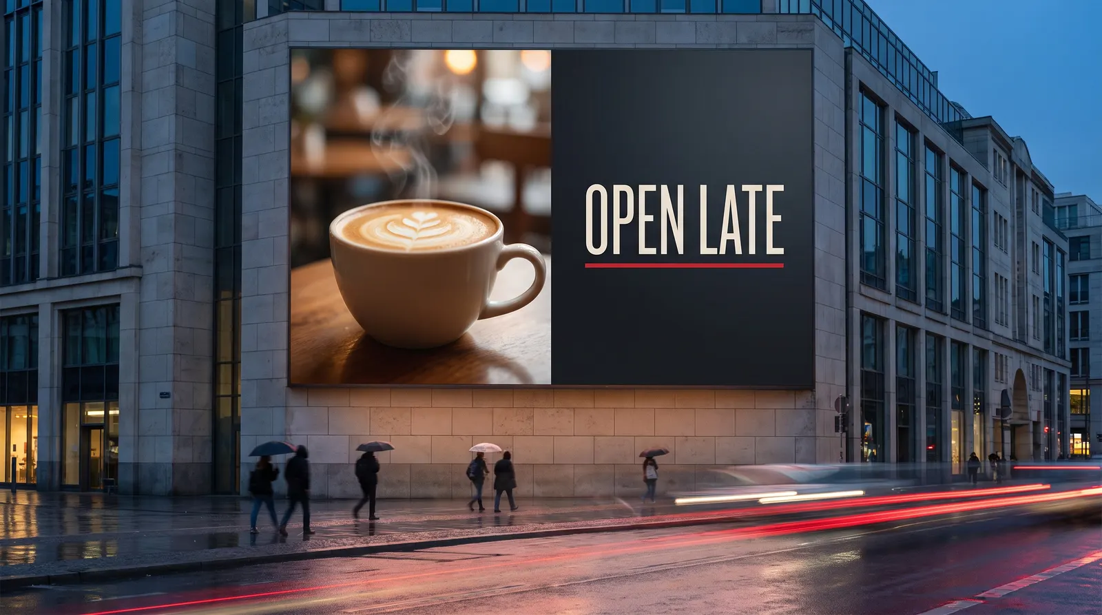
Divide the canvas instead. Photograph in one zone, type in another, a clean edge between them. It is also, not coincidentally, what a professional layout looks like — the image at the top of this article does exactly that: photograph left, dark field and four words right.
If the type genuinely must sit over the picture, put it over a flat, dark, deliberately boring region of it, or lay a solid scrim underneath. A 40% black gradient is not a scrim; it is a way of making the type hard to read and the photograph muddy at the same time.
9. Keep it simple
The screen has a few seconds of someone’s attention and it is competing with traffic, shopfronts, conversation and a phone. Everything that is not the message is taking room from the message.
Cut the second logo, the URL nobody will type, the social icons, the small print, the border. If a client insists on nine elements, give them nine slides.
10. Reduce the motion
Because a wall can animate, everything gets animated: text flying in from four directions, images pushing and zooming, a logo that spins. It looks impressive in the studio on a 27-inch monitor and it is unreadable at 4 metres across.
Motion should carry meaning — reveal a price, move the eye from one zone to the next — or it should not be there. Slow, single-axis, one thing at a time. And anything moving fast on a wall with a low refresh rate will strobe and tear, which brings us to the camera problem: if the screen will ever be filmed, it needs at least 1 920 Hz refresh, and 3 840 Hz for broadcast. Below that you get rolling bands on every shot, and no amount of content design fixes it.
11. Get the timing right
For advertising, a spot runs somewhere between 6 and 30 seconds, and the industry has settled on about 10 as the norm. Within a clip, no slide should be shorter than 3 to 4 seconds — below that, someone who glances up mid-slide gets nothing at all.
Work back from the loop, not forward from the content. If eight advertisers share the wall at 10 seconds each, the loop is 80 seconds, and a passer-by who stands for 20 seconds sees two of them. If that is not good enough for the advertiser, the answer is a shorter loop, not a longer spot.
12. Keep transitions boring
Cut, fade, or slide. That is the list. Every wipe, cube, page-curl and particle dissolve draws attention to the join instead of to the next message, and most of them look cheap at scale in a way they never do in a preview window.
Subtle, but visible: the audience should register that something changed, and not what.
13. Go and look at it
Then go back a month later. Content that was right at handover drifts: the schedule fills with whatever was to hand, someone uploads a slide made for a 16:9 monitor, the brightness is still on the summer setting in November.
Stand where the audience stands — across the road, at the far end of the concourse, in the car — and look at it for a full loop. Then make sure one named person owns the content, because this is a skill that improves with repetition and dies when it is everybody’s job.
Why this belongs in your sales conversation
None of this is your job, strictly. You are selling a wall, not running a channel. But the client does not separate the two, and a screen showing bad content is a reference site you cannot use and a repeat order you do not get.
It is also free differentiation. Every competitor is quoting pitch, brightness and price. Arriving with the pixel dimensions of their artwork, a cap-height figure for their viewing distance, and a warning about what a white background will do to their electricity bill is the kind of thing that makes a buyer decide who to work with — before the price is even on the table.